Monday, 21 March 2011
Monday, 28 February 2011

2. Yes Jack Nicholson, and Michael Keaton.
3.The mood is quiet dark this reflects what the mood of the film is really like.
4. Gotham city is behind them.
5. The text next to the jokers face describes the outline of the film.
6.no
7. I don't think it is very pursasive because it doesn't reveal enough.
 |
| One of the film posters for the Dark Knight |
1. The movie title is at the bottom of the poster.
2.Yes the are Batman (Christian Bale),Joker (Heath ledger) and Harvey dent(Aaron eckhart)
3.The design is to show the mood which is dark and scary.
4. The three characters are holding different objects.
5. The only text show is the title and the writing on the badge.
6. The faces of half the characters are covered up.
7.I think it is really persuasive because it shows the mood and tone of the film, also giving away the key villian of the film.
Monday, 14 February 2011


Thursday, 10 February 2011
Camera obscura lesson
In this lesson we created a Camera obscurer using pringles tube and some paper.
We first cut a quarter of pringles tube off we then sellotaped. We then sellotaped the cut off end and but it on the other end of the tube. afterwards we made a small whole in the metal end of the tube. we then finished by cover the tube in foil.
We first cut a quarter of pringles tube off we then sellotaped. We then sellotaped the cut off end and but it on the other end of the tube. afterwards we made a small whole in the metal end of the tube. we then finished by cover the tube in foil.
Monday, 7 February 2011
Muybridge Test
 |
| First picture from camera 1 |
 |
| Second picture from camera 2 |
 |
| Third picture from camera |
 |
| Picture 4 from camera |
Thursday, 9 December 2010
Monday, 6 December 2010
1. What are you thoughts on the finished product:? (50 Words Min)
2. Does it look how you originally planned? (50 Words Min)
3. What do you think about the qualities of your work? In Focus, Good bad light etc? (50 Words Min)
4. Give your ideas about comments from others, eg audience, peers, tutors, client
2. Does it look how you originally planned? (50 Words Min)
3. What do you think about the qualities of your work? In Focus, Good bad light etc? (50 Words Min)
4. Give your ideas about comments from others, eg audience, peers, tutors, client
1.I thought that most of my pictures are really bad because they were mostly blurred but at the time of taking the pictures they appeared fine however when I uploaded them they turned out blurry and out of focus. out of six odd photo only one came out in focus I found this really disappointing because I thought at the time the pictures were good.
2. The pictures didn't turn out how I originally planned because they were out of focus and because on the day I changed where I was going to be taking the pictures. at first I was originally going to be taking some of my pictures in hair and beauty by I decided against it as I was waiting for permission to take pictures there.
3. I think that most of the pictures are out of focus this maybe because of bad lighting or the camera being on the wrong settings but i think if the pictures weren't out of focus the quality would been much better as I knew what I wanted to take the pictures of.
4. I think most of the comments on my work were accurate as they picked up on the pictures being blurry and out of focus I think this helped because it made me realise more that my pictures weren't in focus when I took them. it was helpful because now I know what to do differently next time I take pictures.
Monday, 29 November 2010

Monday, 22 November 2010
This task is to Print, Frame/mount you pictures in lesson for and exhibition. To plan for this exhibition you will need as a class to think about:
· Where to hold the exhibition: T42
· How it might look: The pictures will be set on the walls and a powerpoint presentation will be playing
· Who to invite: Freinds
· Titles for the Photos: Little people and music, Little people listen to music, Danger incoming, crossing the road, Big words for a small person, At the libary, Watching the words go by, A bench on the stairs, A passer by, On top of techonlogy, At the bottom of technolog.
· Health and Safety: Remove all obvious hazards such as objects that could be triped on
Monday, 15 November 2010


Monday, 8 November 2010
Portfolio planning sheet
Portfolio title: | The small people of college. |
Target audience: | People that are interested ion coming to the college. |
Theme: | The courses of college. |
Presentation medium: (print/Web/slideshow) | Slideshow |
Portfolio goals and objectives: | ● What does the project aim to do? To show people what they can do at the college. ● What effect do you want to have on the audience? To be interested the college. ● Is there a question you are exploring? N/A |
Portfolio description: | Explain the types of images the portfolio will contain, such as: ● Close-ups ● Long shots |
Location and resources: | ● Where will your images be taken? ● Hair and Beauty ● Le cordon vert (the resturant) ● T47 ● Reception ● What equipment will you need? We will need a camera using the macro settings. |
Thursday, 4 November 2010
Slinkachu
28/m/UK
5ft9
Inactive 1979-2006
Active 2006-Present.
The pictures are taken using macro. he uses random objects such as cans and rubbish when he takes his pictures of the little people to replace things such as houses, cars and train tunnels (as pictured)
28/m/UK
5ft9
Inactive 1979-2006
Active 2006-Present.
The pictures are taken using macro. he uses random objects such as cans and rubbish when he takes his pictures of the little people to replace things such as houses, cars and train tunnels (as pictured)
 |
| The can is trying to show the drunken man. |
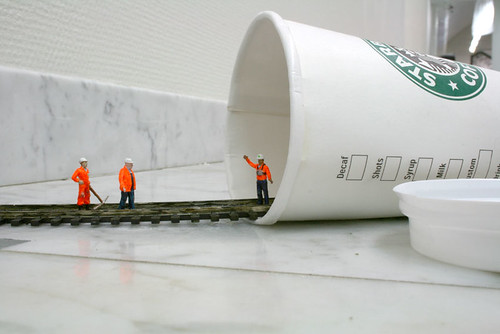 |
| He has used a Starbucks coffee cup to give the idea of there entering a train tunnel. |
 |
| it is showing a small boat rescuing a drowning man in a puddle |
Thursday, 21 October 2010
Iphoto edits
 |
| I added an effect called B&W. |
 |
| I retouched the bottom of the picture so it was dark underneath. |
 |
| I colour faded the pciture and cropped it so the focus was on county mall. |
Monday, 18 October 2010
Macro Photography Monday 18th OIctober
 |
| This is a close up of a screw driver |
 |
| This is a blurred picture of staples |
 |
| A close up of staples |
 |
| This is a close up of a staple remover |

 |
| This is a close of keys |
 |
| This is a close up of a box of staples |
 |
| This is a close up of a box of staples |
 |
| This is a close up of a box of staples |
 |
| This is a close up of a box of staples |
 |
| This is a close up of a train ticket |
 |
| This is a close up of a plug cover |
 |
| Brandon's eye |
 |
| Brandon's eye |
 |
| On/off button on a computer |
 |
| Close up of a keyboard |
 |
| Close up of a keyboard |
Monday, 11 October 2010


Subscribe to:
Posts (Atom)